
BREATHE MAGAZINE COLLEGE EDITION | Case study

OVERVIEW
Breathe Magazine College Edition is the first-pick mindfulness magazine for college students. Inside you will find advice and mental health guides to create a happier and healthier college life. The aim of Breathe Magazine College Edition is to help you take care of yourself first to be able to take care of those grades next. Each issue includes beautiful illustrations, expert advice, and inspiring features such as How to Achieve "Relief from Stress, Increase Resilience and Find Greater Happiness.
SOLUTION
In order to meet the goal of creating a mindfulness magazine for college students, I created a visual identity system associated with inspiring illustrations and relatable articles to advise college students on how to maneuver their way through campus, class, dorm life, and more.

Do Nothing Feature Story

Hangover Helper Article

Mindful Article
PROJECT TYPE
Magazine | 32 Pages
DELIVERABLES
Print Publication, Brand Identity
REQUIREMENTS
Front cover/back cover, magazine logo, spine, table of contents, masthead/contributors sections, front briefs section with a letter from the editor and meet our team, 1 article feature-mostly text-based, 1 photo/art-driven feature, 2 infographics, and a back section with shorter articles.

Research
The target audience is female college students, ages 18-25.
Goal
My extensive research behind each article was to ensure students would be able to relate and absorb the information. The tone of the articles are informative, yet casual for the reader to enjoy and maybe laugh a bit. The article titles were chosen to relate and intrigue the reader. All illustrations were designed to fit the trendy style that attracts the selected target audience, college women.
articles
The spring issue was designed to guide students through the long semester ahead. The articles selected are from issues of the Breathe Magazine and tweaked to fit the target audience’s attention.
*Sourced material credits are located in the gutter.

MOOD BOARD
The actual Breathe Magazine spoke more to the postgrad/mom demographic. Incorporating that as the foundation lead to the college-age demographic being an area for marketing opportunity.
Currently, there is not a magazine on the market designed specifically for the mental health of college students. Which sparked the creation of this spin-off to the original Breathe magazine that focus on women’s mental health.
The use of hand-drawn illustrations, pastel colors, and simple attractive type helped convey the message of mental health importance for stressed-out college students giving it a unique voice on the shelves.
LOGO SKETCHES & Digitization
The original Breathe Magazine logo inspired the logo created for this project. By taking the lower case idea of a thick serif font and adding a connection between the ‘e’ and the ‘a’ communicates the symbolism of a breath and the sense of community. that campus life has to offer.
The subhead “college” was made to be smaller to show that it is a special edition to the original brand name.
1ST DRAFT

2ND DRAFT

FINAL

BRAND IDENTITY
The connection between the ‘e’ and ‘a’ in the name provides recognition and mimics the flow of a breath.
COLOR PALETTE
The color palette of pastels and natural tones helps to furthers the message of peace and tranquility.
TYPOGRAPHY
Trendy bold and handwritten type speaks to the college generations. Typefaces: Lora Bold, Brave Babe, & Lato.
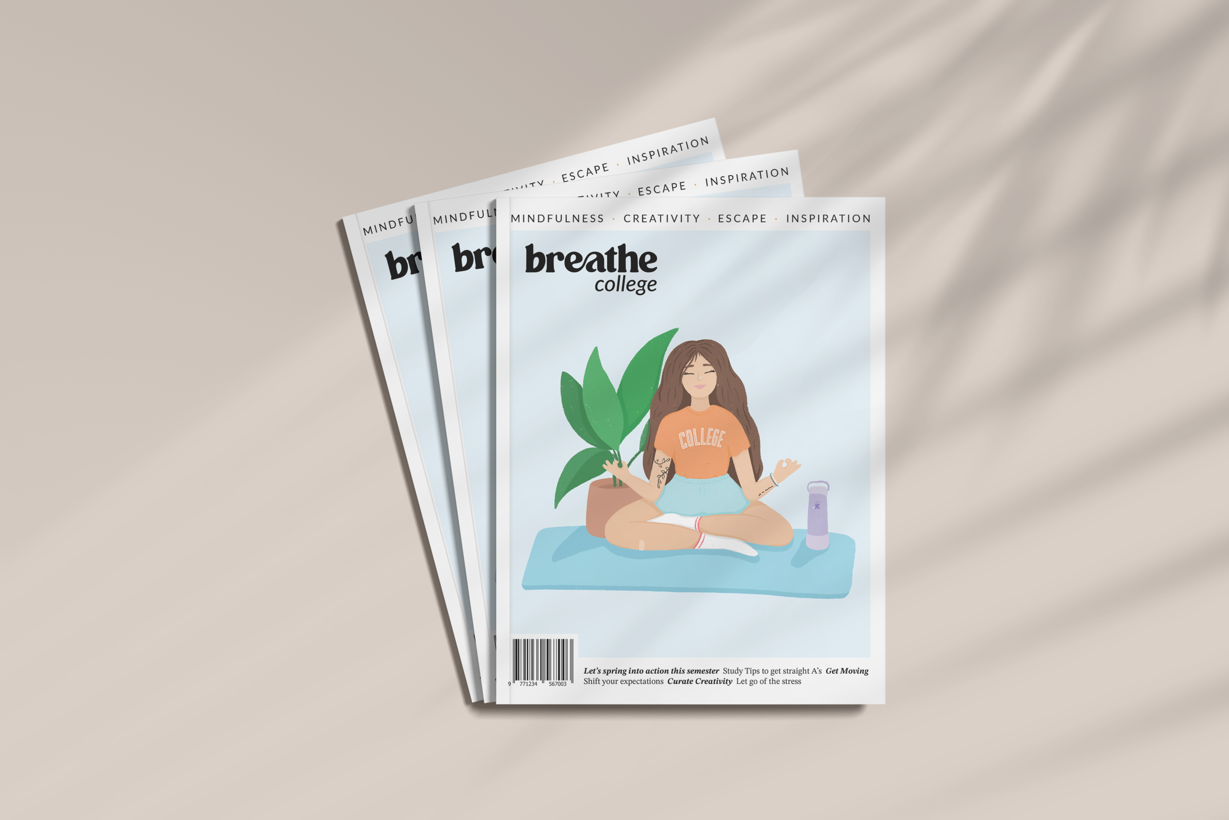
COVER Evolution
The illustrated cover is what sets the Breathe Magazine apart from others on the shelves. To keep cohesion with the Breathe brand it was important to make sure this illustration stood out to female college students.
*When starting this project I was in an autumn mindset but after solidifying a tone and article direction I needed to switch to spring.
1st Concept
2nd Concept
Final Concept

Cover Layout Brainstorming

Internal Spread Layout Brainstorming

Final Solution
SOCIAL MEDIA ADS + Posts


Copyright Statement
The executions shown were created for a class project, with no affiliation to Breathe Magazine.
All images, logos, products, videos, and other copyrights or trademarks featured, mentioned, or referred to within the project are the property of Breathe Magazine. The use of the trade name, copyright, or trademark in my student portfolio is for identification and reference purposes only and does not imply any association with the copyright or trademark holder of their product or brand. My work is not affiliated, associated, authorized, maintained, sponsored, endorsed by, or in any way officially connected with these copyright or trademark holders. Breathe Magazine does not sponsor or endorse any of the shown work. I declare no affiliation, sponsorship, or partnerships with any copyright or trademark holders.